Difference between revisions of "Data"
(add some stats!) |
|||
| Line 24: | Line 24: | ||
In addition to visual graphs, we can also conduct statistical analyses. These apply somewhat comparable techniques to what the mind does anyways, but numerically. For example, we can look for correlations of sinus symptoms with various other events. Alternatively, we can use more advanced statistical techniques like analysis of variance. | In addition to visual graphs, we can also conduct statistical analyses. These apply somewhat comparable techniques to what the mind does anyways, but numerically. For example, we can look for correlations of sinus symptoms with various other events. Alternatively, we can use more advanced statistical techniques like analysis of variance. | ||
| + | |||
| + | ==Results== | ||
| + | |||
| + | Some results that one individual has noticed thus far from data analysis, which may not apply to other people, include: | ||
| + | |||
| + | * A negative correlation of sinus symptom intensity with air temperature (-0.31). | ||
| + | ** Better sinuses in cooler temperatures. | ||
| + | * A positive correlation of sinus symptom intensity with visibility (0.07). | ||
| + | ** Better sinuses on clearer days. | ||
| + | * A negative correlation of sinus symptom intensity with time of day (-0.18). | ||
| + | ** Better sinuses early in the day. | ||
| + | * A positive correlation of sinus symptom intensity with air pressure (0.14). | ||
| + | ** Better sinuses in high pressure (which correlates with clear days). | ||
[[Category: Sinuses]] | [[Category: Sinuses]] | ||
Revision as of 07:20, 18 July 2021

Sinus data can assist people in identifying causes, correlations, or patterns in their sinus symptoms. Some ideas of data to analyze include:
- Sinus symptoms
- Weather
- Allergens
- Diet
- Exercise
- Time of day/month/year
- Add your ideas!
Graphs

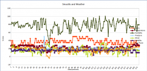
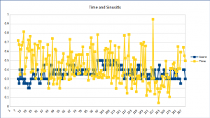
We can make graphs of sinusitis symptoms including time series.
Graphs show data in a format that people can easily see. There are numerous graph types, including these line graphs, as well as bar charts, pie graphs, and others. The goal is to make it easy to see associations. This can assist people in discerning what may cause symptoms.
You can document data using standard spreadsheet software, such as the freely available LibreOffice Calc. There are also specific tools for medical symptom data.
Statistics
In addition to visual graphs, we can also conduct statistical analyses. These apply somewhat comparable techniques to what the mind does anyways, but numerically. For example, we can look for correlations of sinus symptoms with various other events. Alternatively, we can use more advanced statistical techniques like analysis of variance.
Results
Some results that one individual has noticed thus far from data analysis, which may not apply to other people, include:
- A negative correlation of sinus symptom intensity with air temperature (-0.31).
- Better sinuses in cooler temperatures.
- A positive correlation of sinus symptom intensity with visibility (0.07).
- Better sinuses on clearer days.
- A negative correlation of sinus symptom intensity with time of day (-0.18).
- Better sinuses early in the day.
- A positive correlation of sinus symptom intensity with air pressure (0.14).
- Better sinuses in high pressure (which correlates with clear days).