Difference between revisions of "Data"
Jump to navigation
Jump to search
(→Graphs: add some info) |
(→Graphs: add tools) |
||
| Line 18: | Line 18: | ||
Graphs show data in a format that people can easily see. There are numerous graph types, including these line graphs, as well as bar charts, pie graphs, and others. The goal is to make it easy to see associations. This can assist people in discerning what may [[cause]] symptoms. | Graphs show data in a format that people can easily see. There are numerous graph types, including these line graphs, as well as bar charts, pie graphs, and others. The goal is to make it easy to see associations. This can assist people in discerning what may [[cause]] symptoms. | ||
| + | |||
| + | You can document data using standard spreadsheet software, such as the freely available [https://www.libreoffice.org/discover/calc/ LibreOffice Calc]. There are also specific tools for medical symptom data. | ||
Revision as of 07:04, 18 July 2021

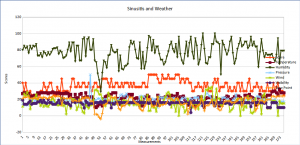
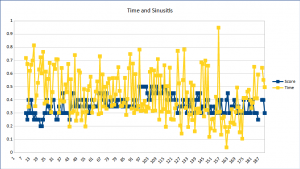
We can make graphs of sinusitis symptoms including time series.
Sinus data can assist people in identifying causes, correlations, or patterns in their sinus symptoms. Some ideas of data to analyze include:
- Sinus symptoms
- Weather
- Allergens
- Diet
- Exercise
- Time of day/month/year
- Add your ideas!
Graphs

We can make graphs of sinusitis symptoms including time series.
We can make graphs of sinusitis symptoms including time series.
Graphs show data in a format that people can easily see. There are numerous graph types, including these line graphs, as well as bar charts, pie graphs, and others. The goal is to make it easy to see associations. This can assist people in discerning what may cause symptoms.
You can document data using standard spreadsheet software, such as the freely available LibreOffice Calc. There are also specific tools for medical symptom data.